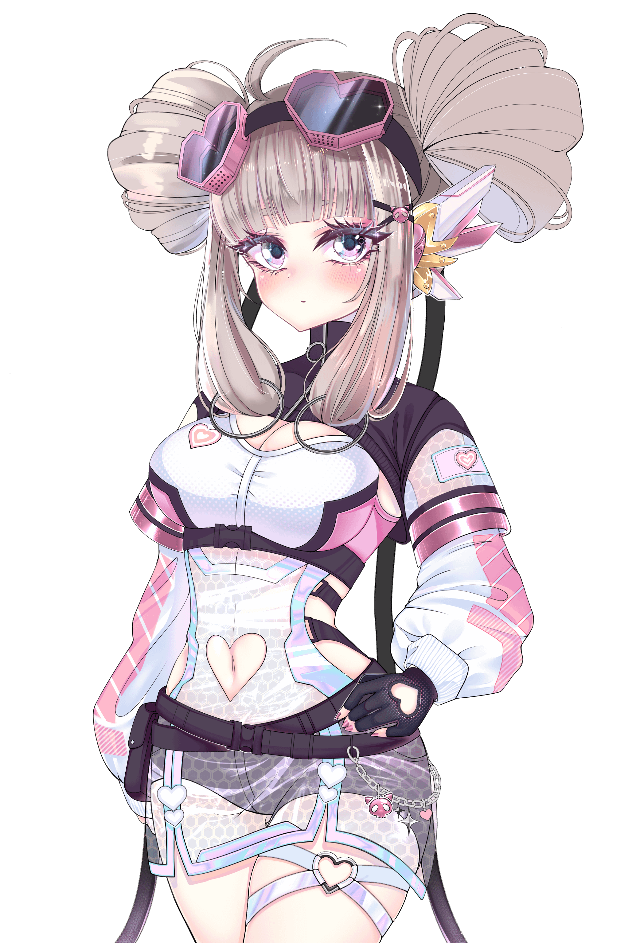
oh wow, your art is amazing! I may be nitpicking, but the character’s neck and head might be placed too much on the dorsal side of the body, and could maybe be moved towards the ventral side a little bit? Amazing art, regardless!
Steady_Ri0t on
The glove and belt are basically the same color so it’s a little hard to see what’s going on in that spot. The nose looks a little too far to our left side
The “cleavage line”, for lack of a better term, is going a little crazy. The breasts connect up to the shoulder area so even in a pushup bra there wouldn’t be that much separation or circular-ness going on. Only poorly done boobs jobs might look like that. I’d recommend using references of girls in push-up bras if you want that much cleavage going on, or normal bras or bikini tops if you want a more natural look. Also worth taking a look at the muscle and anatomy of the chest to help understand what’s going on in that area.
And there’s my paragraph about boobs lol. Overall though I think it’s a cute design and I like the color choices

3 Comments
oh wow, your art is amazing! I may be nitpicking, but the character’s neck and head might be placed too much on the dorsal side of the body, and could maybe be moved towards the ventral side a little bit? Amazing art, regardless!
The glove and belt are basically the same color so it’s a little hard to see what’s going on in that spot. The nose looks a little too far to our left side
The “cleavage line”, for lack of a better term, is going a little crazy. The breasts connect up to the shoulder area so even in a pushup bra there wouldn’t be that much separation or circular-ness going on. Only poorly done boobs jobs might look like that. I’d recommend using references of girls in push-up bras if you want that much cleavage going on, or normal bras or bikini tops if you want a more natural look. Also worth taking a look at the muscle and anatomy of the chest to help understand what’s going on in that area.
And there’s my paragraph about boobs lol. Overall though I think it’s a cute design and I like the color choices
Needs a more defined nose.